k-12 testing software
OVERVIEW
The software used to deliver tests via computers to school aged children was sorely outdated and needed a modern overhaul to bring it into line with current best practices.
SOLUTION
The previous software was put through various rounds of user testing in order to inform a new design. The new design focused on more real estate to the test itself and a clean design that matched with design paradigms at the time.
RESULT
A new test delivery system (TDS) was developed and has been through several additions for additional functionality and accessibility since its launch in 2016. It’s been used by over 100,000+ children in over 6 states so far.
ROLES
UX/UI design
Info architecture
Iconography
SCOPE
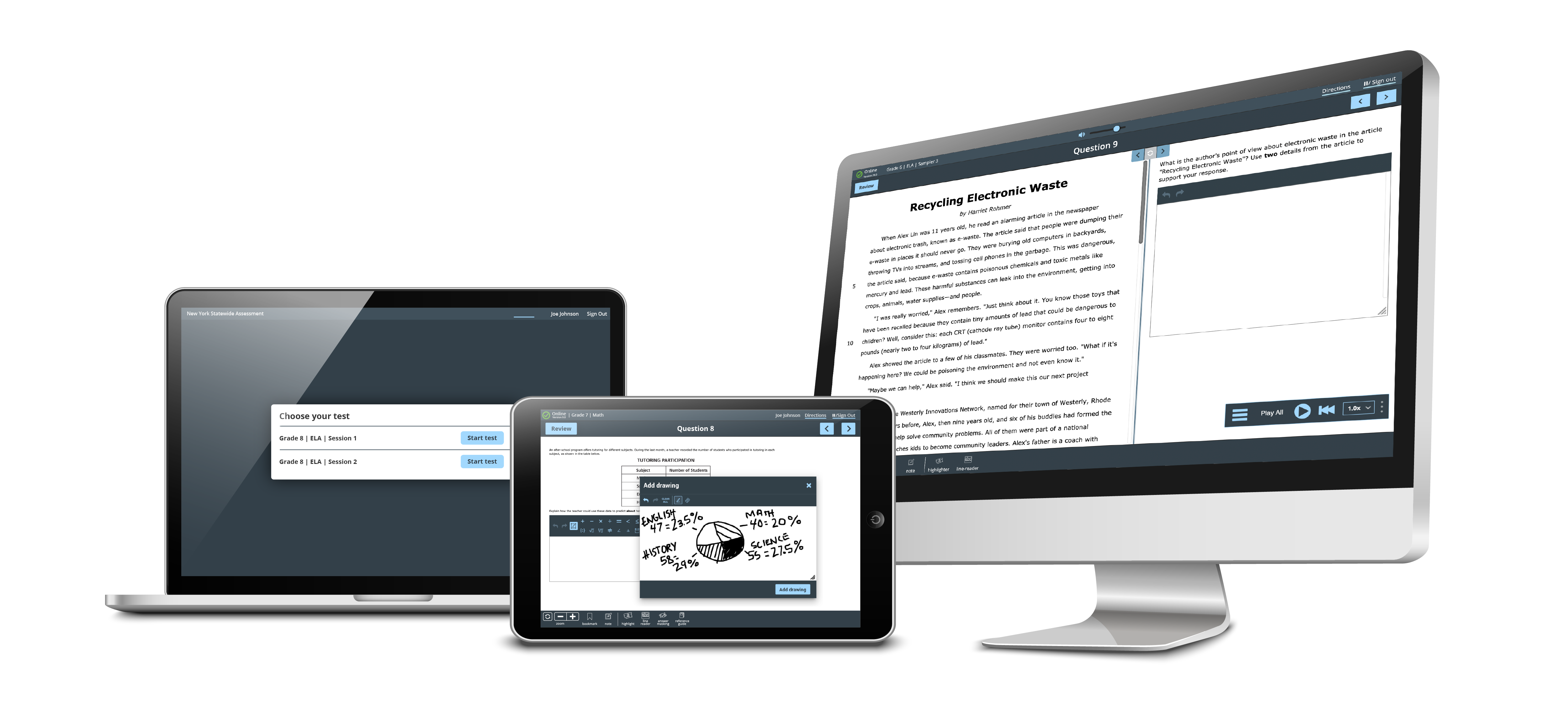
– iPad & desktop
– Touch & mouse/keyboard
– WCAG 3.0 compliant
THE OLD TEST PLATFORM (pre-2016)
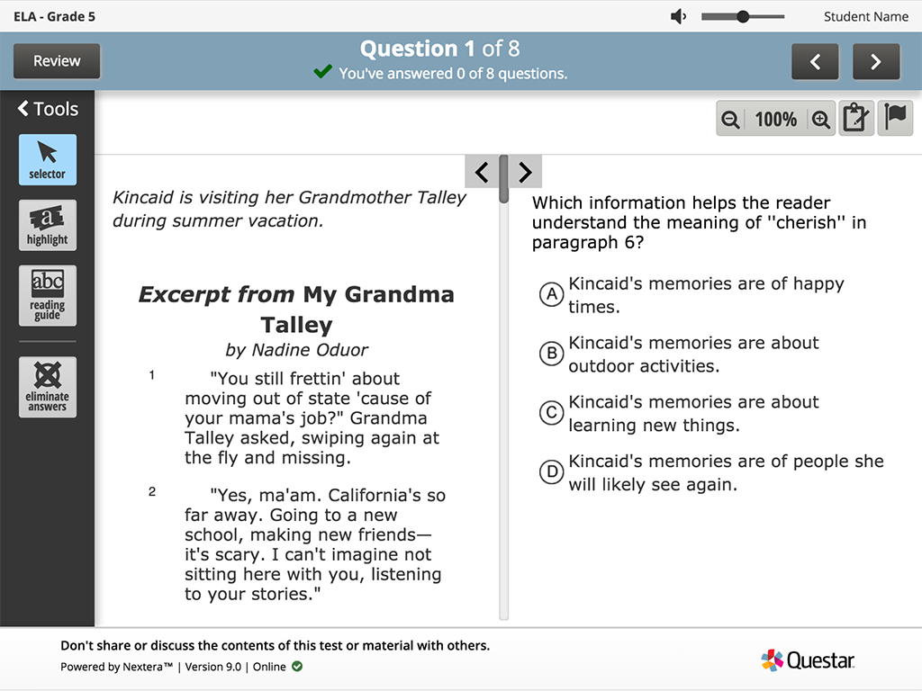
MAIN ISSUES
- The old design was touch friendly, but didn’t really meet the needs of touch or mouse & keyboard users.
- Almost half of the screen (44%) is dedicated to non-test areas. This translates into a lot of lost real estate (especially for small screens).
- The dated design didn’t feel as friendly or exciting to use.
PREPARING FOR CHANGE
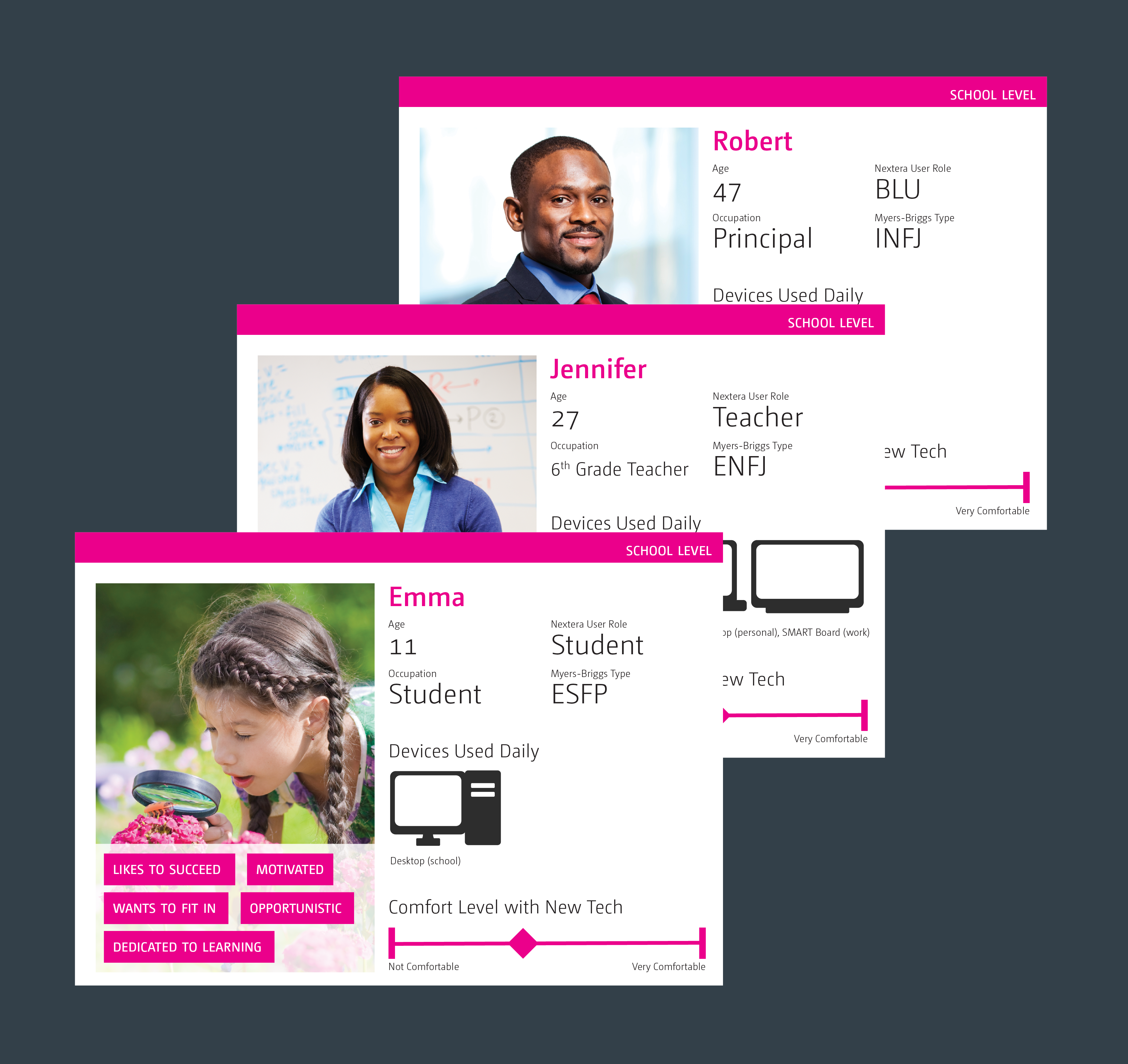
PERSONAS
To help introduce the change to the company, a set of personas was created to give context to why decisions were being made. Personas were created based on user interviews with internal subject matter experts and external users.
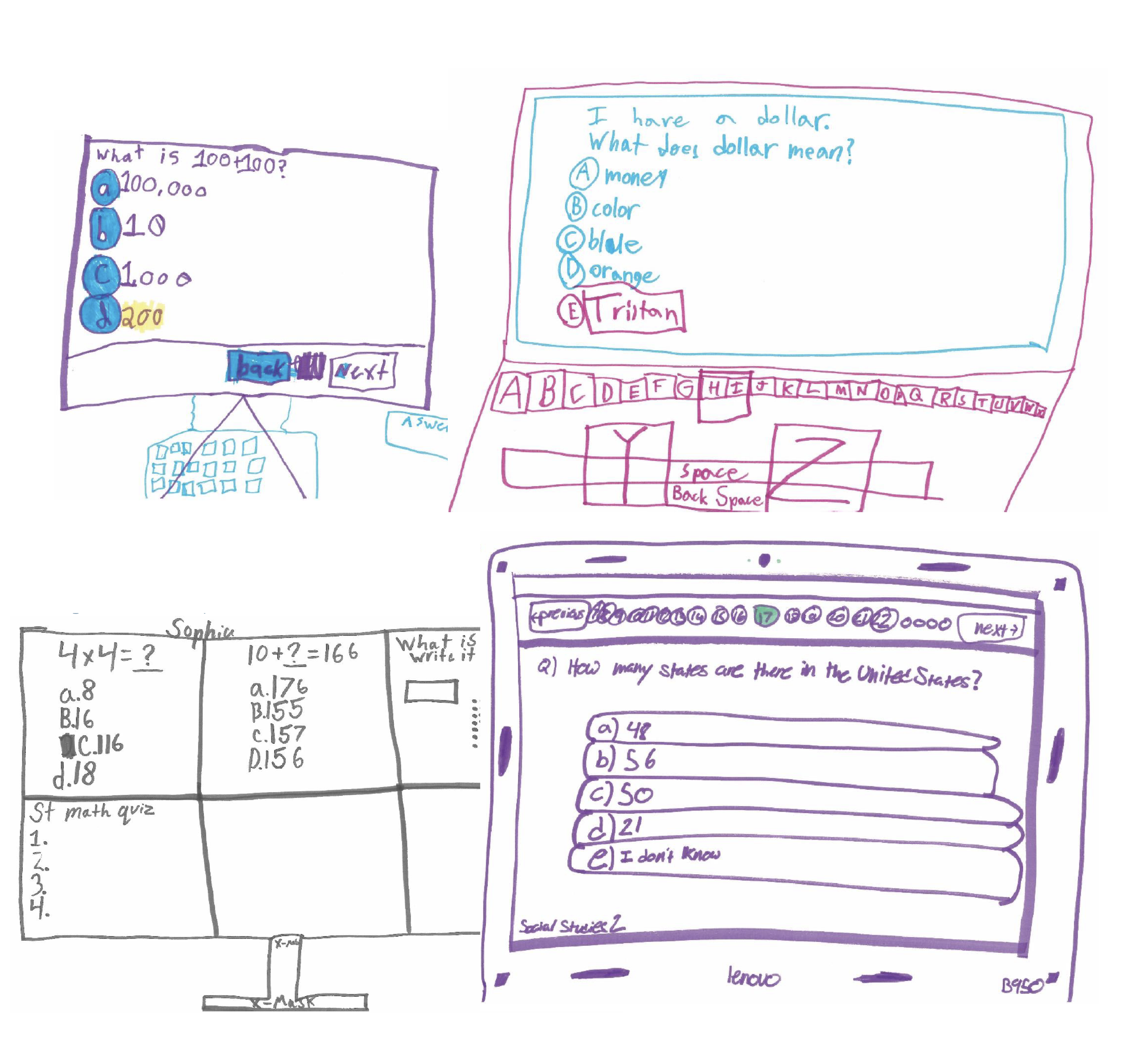
STUDENT INTERVIEWS
The old testing platform was tested with a group of students between the ages of 7-16. Along with observing them performing various tasks within the test, we also tested for icon recognition and had them draw their ideal test.
Through the course of these interviews we learned some really important things – students liked that the icons were labeled (their test provider just had the icons, which were often difficult to understand without further context), and they struggled to understand some of the more outdated concepts (like the selector tool and flagging a question for instance).
INFORMATION ARCHITECTURE
Since the platform had been updated in bits and pieces over the course of years, no one had a full understanding of the entire user flow a student could take from beginning to end (including all error states and messaging). Part of the process of this redesign was mapping out all of the potential paths.

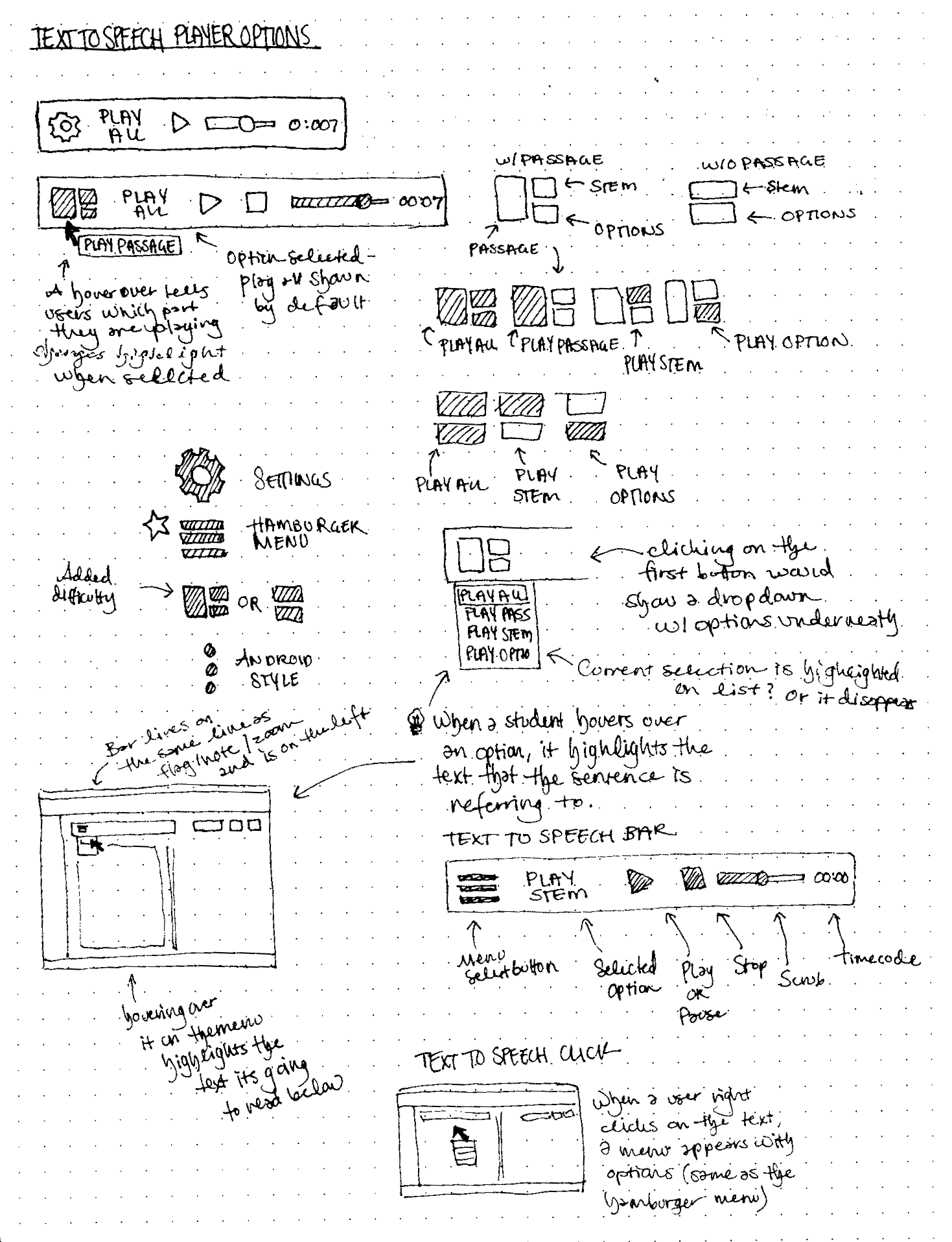
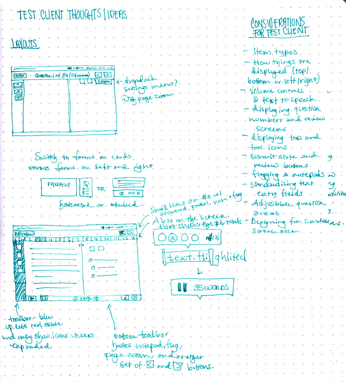
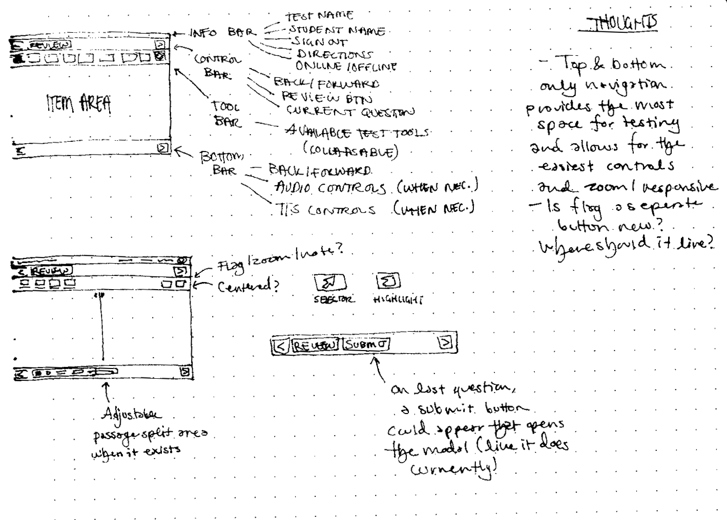
DESIGN PROCESS & SKETCHES
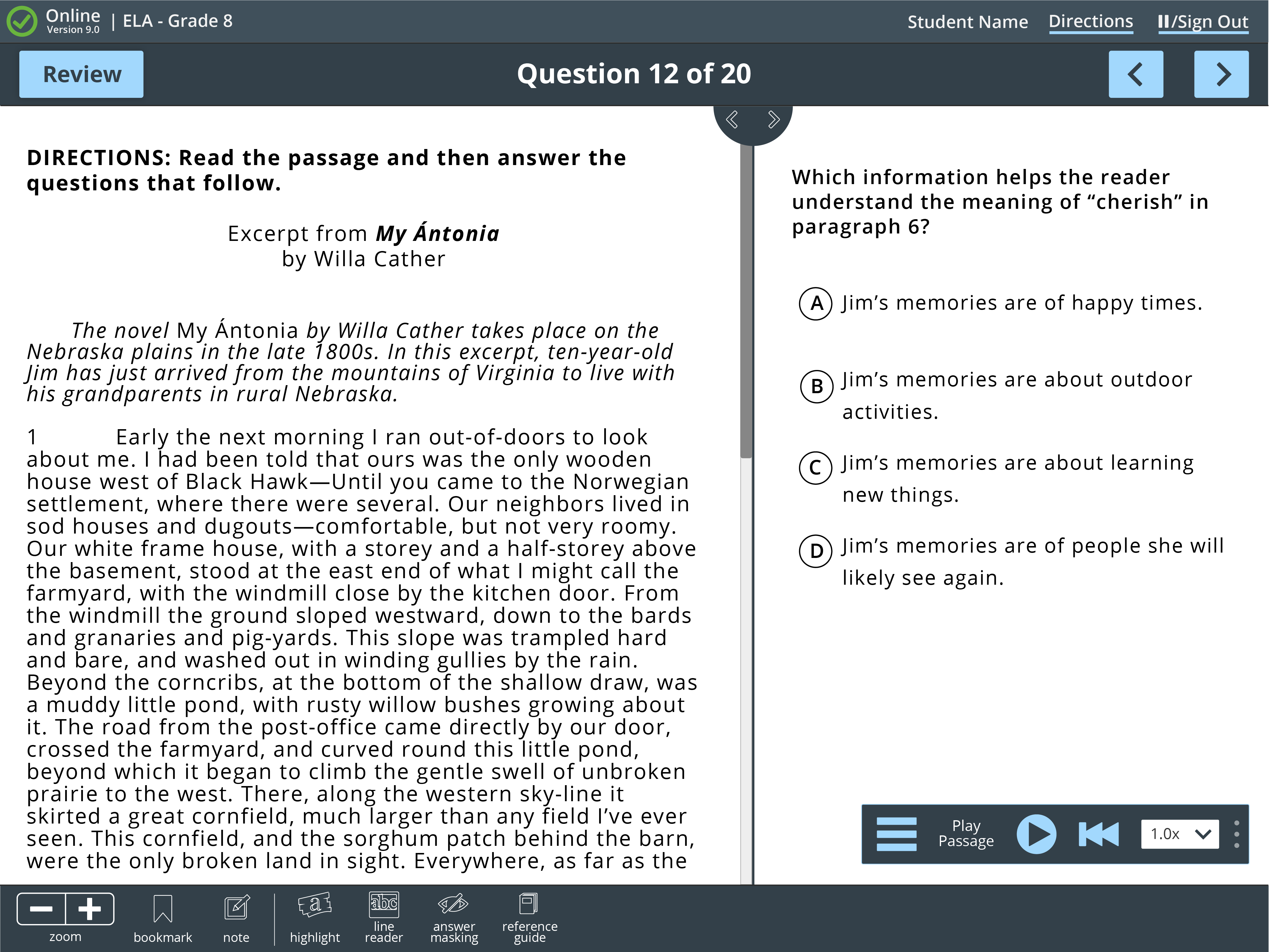
THE FINAL DESIGN
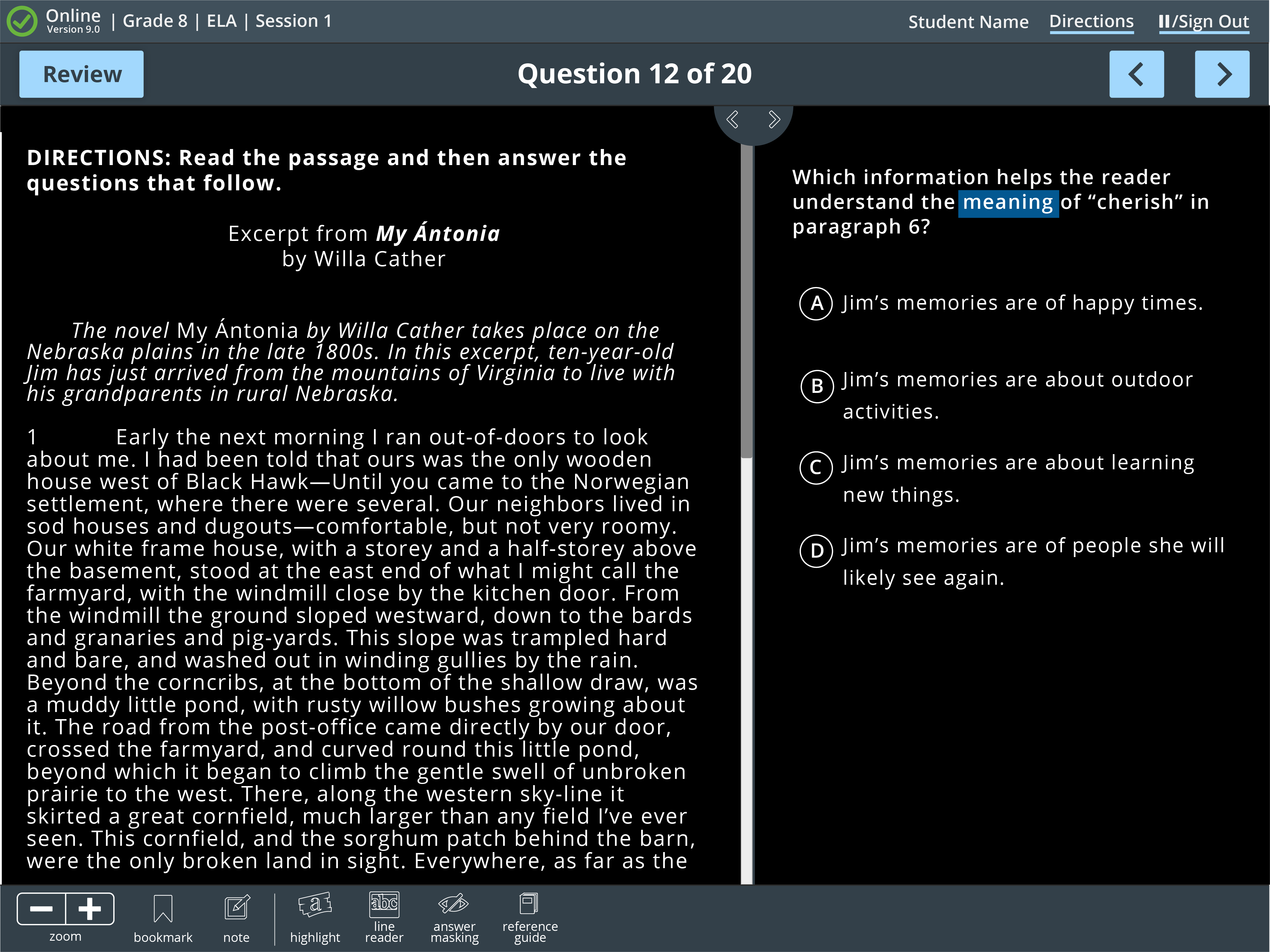
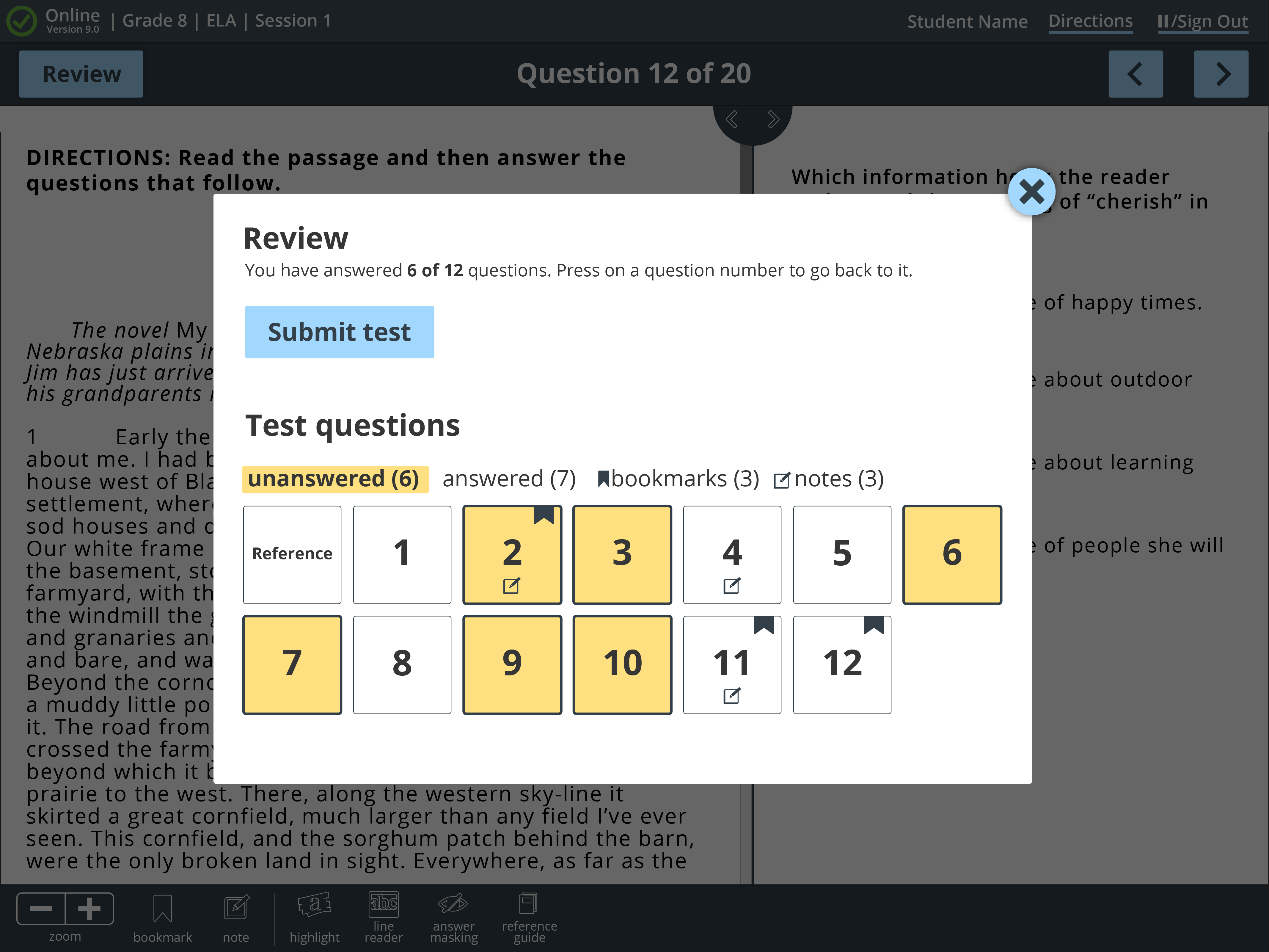
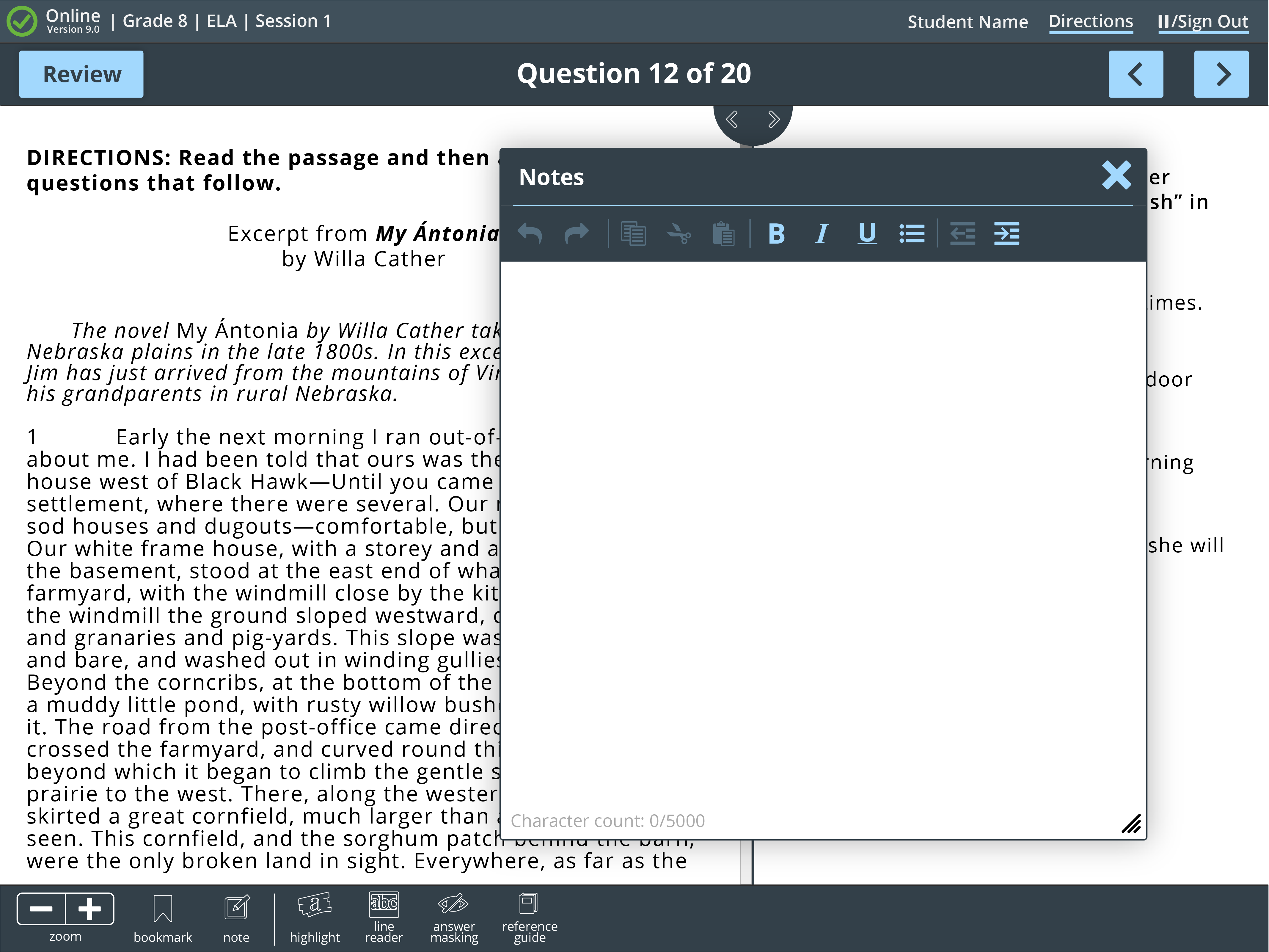
The final design of the testing platform reclaimed nearly half of the unused space in the previous design, putting the focus where it belongs (on the test questions themselves). The design encompassed feedback from multiple source, including students and subject matter experts in the field. The re-write of the application also allowed the team to implement new technology (like text-to-speech).
ICONOGRAPHY
Over 200 custom icons have been made for the test platform. Many of them are very common icons, but given the nature of testing some are very specific.
ACCESSIBILITY
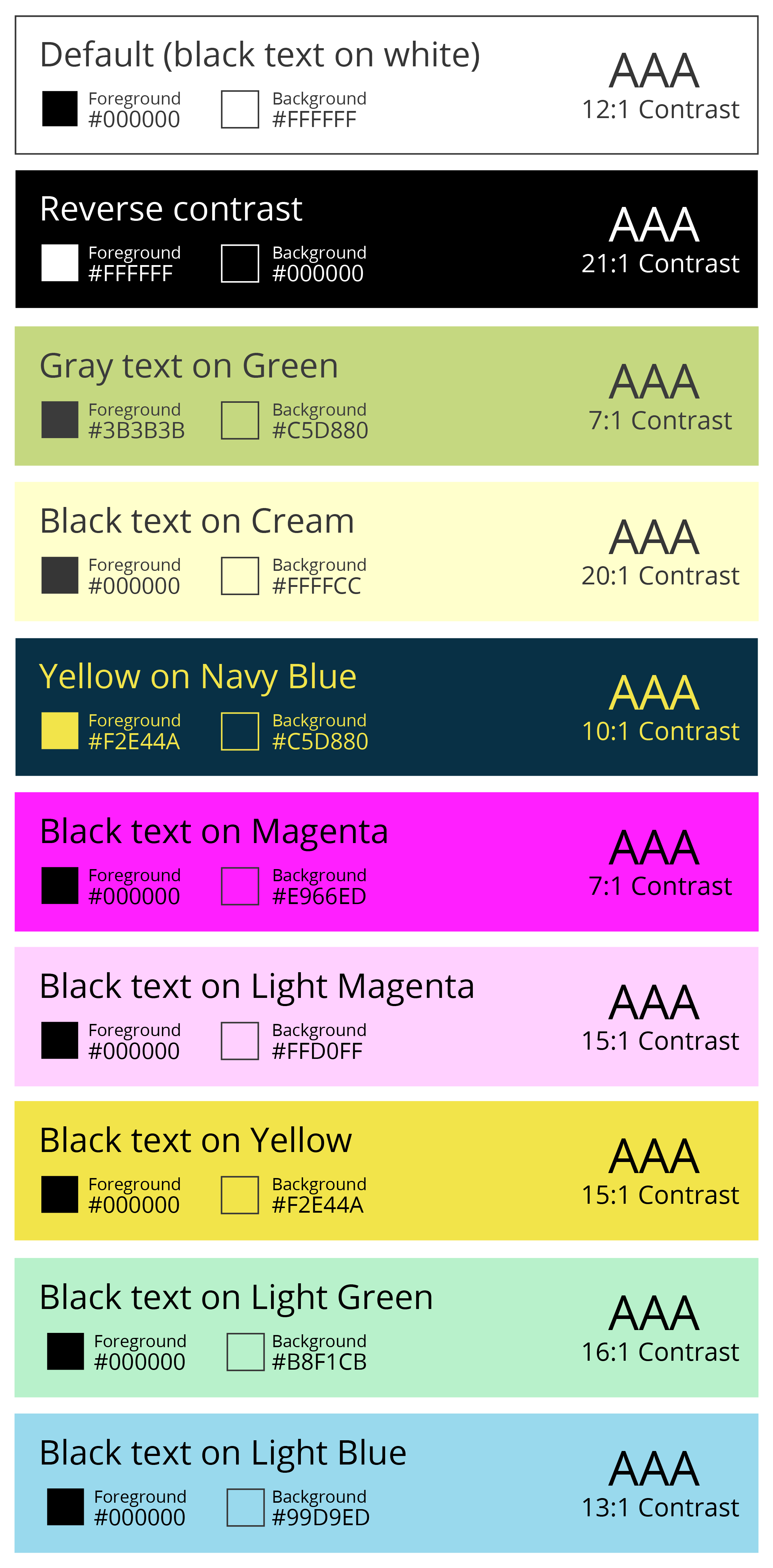
10 custom color combinations, all AAA WCAG 3.0 compliant for contrast ratings were created as options for students to use.
